

This is design you’ve been looking for
Design, right now, couldn’t be more important, and we’re not just saying that because we’re biased. On the most fundamental level, well designed visual cues – we’re talking posters, signage, floor-markings – all play a critical role in signposting public safety, but there’s no excuse for these to be boring. We won’t name names, but the sheer abundance of lack-lustre functional information and passive-aggressive instructions Selotaped at every window, wall and walkway at the moment, is at high risk of blending into one big poorly formatted soup of mundanity. And it’s making us itch.
As the world prepares for life post-pandemic, these haphazard ‘creations’, scribbled in panicky green highlighter pen on the back of an old phone bill, will inevitably have to be replaced with more permanent additions to shop doorways, restaurant tables, till points, office kitchens and meeting spaces, as managers attempt to integrate safety measures into their customer and staff experience. Dear business owners, we implore you – invest in the design of your customer and employee engagement.
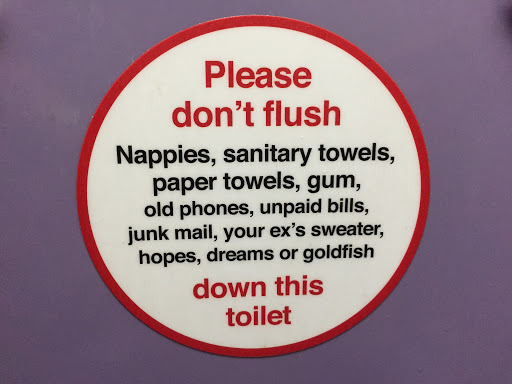
Never underestimate the power of tone of voice. Brand language that adopts a sense of humour can be great, assuming it’s well placed, well timed and – dear lord – well proof-read. When it comes to making mundane messaging memorable, there’s a fine line to tread between gently amusing consumers and getting firmly under their skin. Virgin Train’s now infamous toilet posters caused ripples of delight amongst commuters. Other train companies have since adopted a similar track, but if executed badly, the campaign wheels can quickly fall off. When West Midlands Railway launched their own on-board poster campaign, it fell flat with passengers who deemed its bog snorkeling [sic] humour forced, and that was before they noticed it was riddled with grammatical errors. A prime example of brand language going off the rails.
As restrictions ease, design’s role in rebuilding our world runs far deeper than posters and signs. Design enables us to tackle some of the most complex economic, societal and environmental challenges that we face in modern times. Design is a force; one that can be used for positive change.
Take, for instance, the concept of community. As working from home becomes a more permanent reality for many workers, we can help them see the place they live with fresh eyes: communities to foster, rather than simply a commodity related to a job. Having been indoors and isolated for weeks on end, individuals will want to connect and share experiences with neighbours. Through good design, we can create innovative ways to engage, inspire and entertain people. With well designed websites and booking systems, we can make community hubs such as shops, libraries and cafés accessible again. We can create support networks between businesses and revitalise lost human connections. We can design brands that create a sense of pride in a community, a place.
In retail, as the customer journey becomes increasingly contactless, brands will seek ever more novel ways to boost consumer engagement. It’s a proven principle of retail design that amplifying the sensory qualities of products and spaces helps to create brand attachment and drive retail sales. Touch traditionally plays a weighty role in this. In its piece Please Touch the Merchandise, Harvard Business Review states that ‘physically holding products can create a sense of psychological ownership, driving must-have purchase decisions,’ so how can brands create the same sense of investment when tactility is taken away?
We predict visual and audio-visual design will become even more intrinsic to the retail journey. Even pre-pandemic, the in-store experience movement was gaining serious traction in retail, as brands explored ways to hike up dwindling footfall figures, so we expect to see an even greater adoption of video, sound, even scent, to deliver fully immersive brand experiences and capture buyers’ imaginations, both in-store and online.
It’s a proven aphorism that good design is invisible. Bad design stands out like a sore thumb, distracts us from the purpose and takes us to a place of frustration. The beauty (and value) of good design, lies not in what is seen, but in fact what is unseen – the layers of thought, innovation and creativity that sit beneath the surface. As such, the simplest of front-end user experiences are usually those with the most complex behind-the-scenes processes.
So, readers, consider this your call to action: it’s worth thinking about your rules of engagement, not as an end product, but as a journey; one that delves deep into the psyche of your consumers and delivers more than just superficially.
This is not just a sign; this is design.